6.5. Working with CSS in Drupal. Breakpoints, responsive settings in the Drupal theme
In past tutorials, we have already connected CSS to our topic. To do this, we indicated in the drupalbook.info.yml file:
libraries:
  - drupalbook/global-styling
Next, we created the drupalbook.libraries.yml file, where we already indicated which CSS file to include:
global-styling:
  version: 1.x
  css:
    theme:
      css/style.css: {}
      css/print.css: { media: print }
From now on, we will take a detailed look at how to work with CSS in our theme.
We already wrote in a previous article that you can specify media for each CSS file in curly brackets, for print.css we specified media: print so that this CSS only connects to the print version. There is also media: all (default) for all CSS display modes and media: screen for non-print modes.
CSS Overrides of Other Libraries
You can use libraries-override to override core CSS files:
libraries-override:
  # Replacing the entire library.
  core/drupal.collapse: mytheme/collapse

  # Replacing individual parts of a library, such as a CSS file.
  subtheme/library:
    css:
      theme:
        css/layout.css: css/my-layout.css

  # Removing part of the library.
  drupal/dialog:
    css:
      theme:
        dialog.theme.css: false

  # Removing the entire library.
  core/modernizr: false
Breakpoints in Drupal
Breakpoints in Drupal are part of the theme configuration, they allow you to customize the appearance of the theme depending on the screen size of the device on which the site is displayed. This allows you to make the site adaptive for various devices desktop computers, tablets, phones and even watches. The Breakpoint module standardizes the use of breakpoints, it allows you to monitor device resolution and provide the desired breakpoint. You only need to describe the necessary sizes for breakpoints.
This, of course, is good, but if you configure breakpoints in the topic, then nothing will happen. As an example, you can enable the additional module of the core Drupal Responsive Image and then it will make it possible, using breakpoints, to display images with different presets for different breakpoints. Let's add breakpoints to our theme.
Breakpoint consists of a header and a media query. Media query is the standard way to describe breakpoint. For example, for a 40em-wide breakpoint, you would write '(min-width: 40em)'. Here, the breakpoint is just a media query, but the breakpoints may contain additional information.
In order to add a breakpoint you need to create the file myTheme.breakpoints.yml, I have the drupalbook theme, so the file will be drupalbook.breakpoints.yml.
Each entry in this file is a separate breakpoint, consisting of a machine name that defines the unique name of the breakpoint, and child elements of the breakpoint parameters:
- label: breakpoint title
- mediaQuery: Text to determine the device screen size for this breakpoint
- weight: Weight for the breakpoint. You can set breakpoints with overlapping mediaQuery sizes, so you need weight to determine which breakpoint will be executed first.
- multiplier: Shows how much to multiply the number of pixels to determine mediaQuery. Some devices, such as iphone, use retina displays, where in fact, two physical pixels are used to display one pixel of a site.
drupalbook.breakpoints.yml:
drupalbook.mobile:
  label: mobile
  mediaQuery: ''
  weight: 0
  multipliers:
    - 1x
drupalbook.narrow:
  label: narrow
  mediaQuery: 'all and (min-width: 560px) and (max-width: 850px)'
  weight: 1
  multipliers:
    - 1x
drupalbook.wide:
  label: wide
  mediaQuery: 'all and (min-width: 851px)'
  weight: 2
  multipliers:
    - 1x
Here you need to add such a file to our theme, only you will have the name of your theme instead of drupalbook.
Responsive image
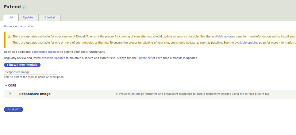
Now let's turn on the Responsive Image module:
Now if you go to the Responsive image styles edit page:
admin/config/media/responsive-image-style
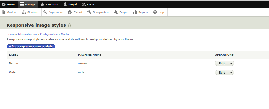
Then you can go into editing the responsive preset of Narrow:
admin/config/media/responsive-image-style/narrow
And specify to take Narrow sizes from our theme:
screenshot
Now you can set presets for the responsive Narrow preset for each breakpoint separately:
screenshot
Now if we set some field to be displayed through the Narrow preset, then we will display different images under different screen resolutions:
screenshot